iOS
Challengrs
Challengrs is a photo-verified fitness challenge app inspired by a real friend-group accountability system.
Overview
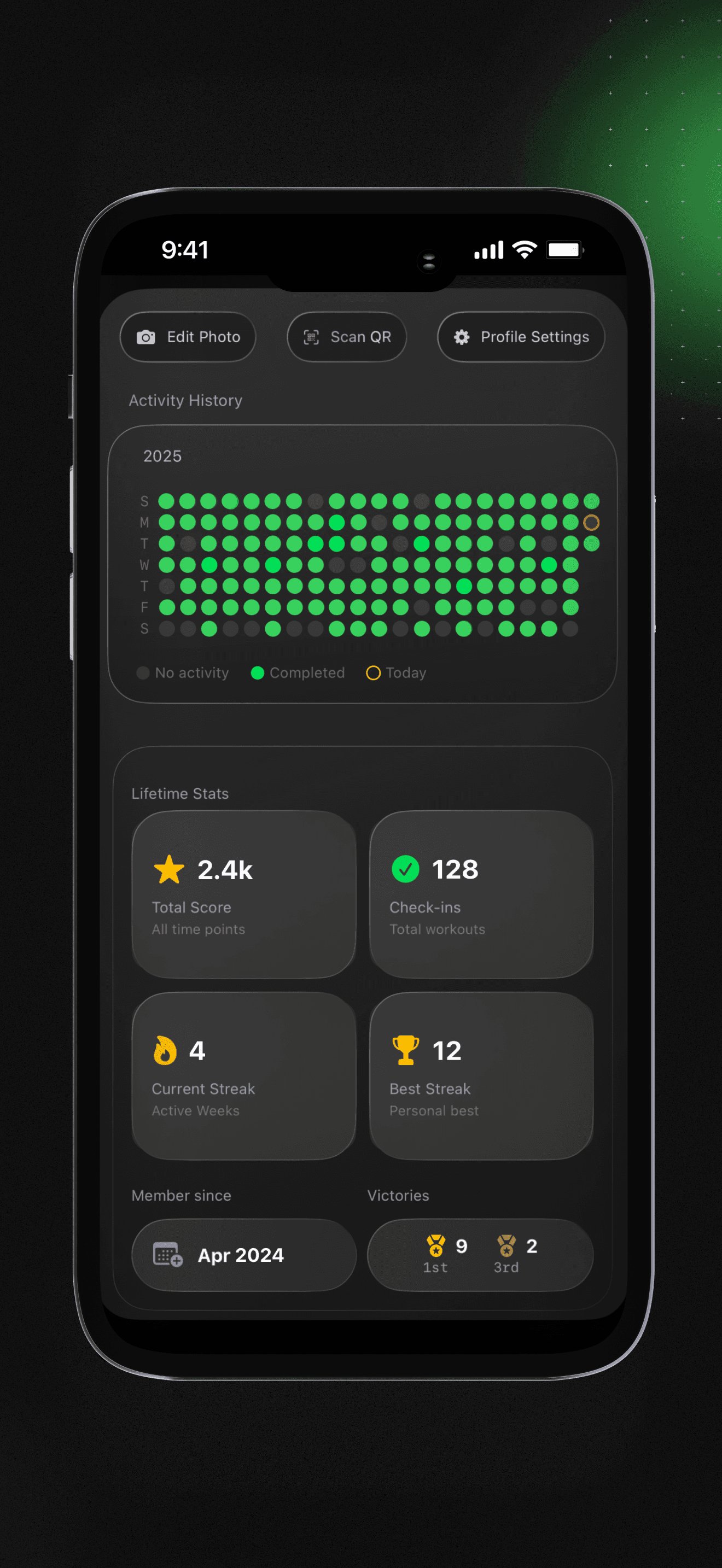
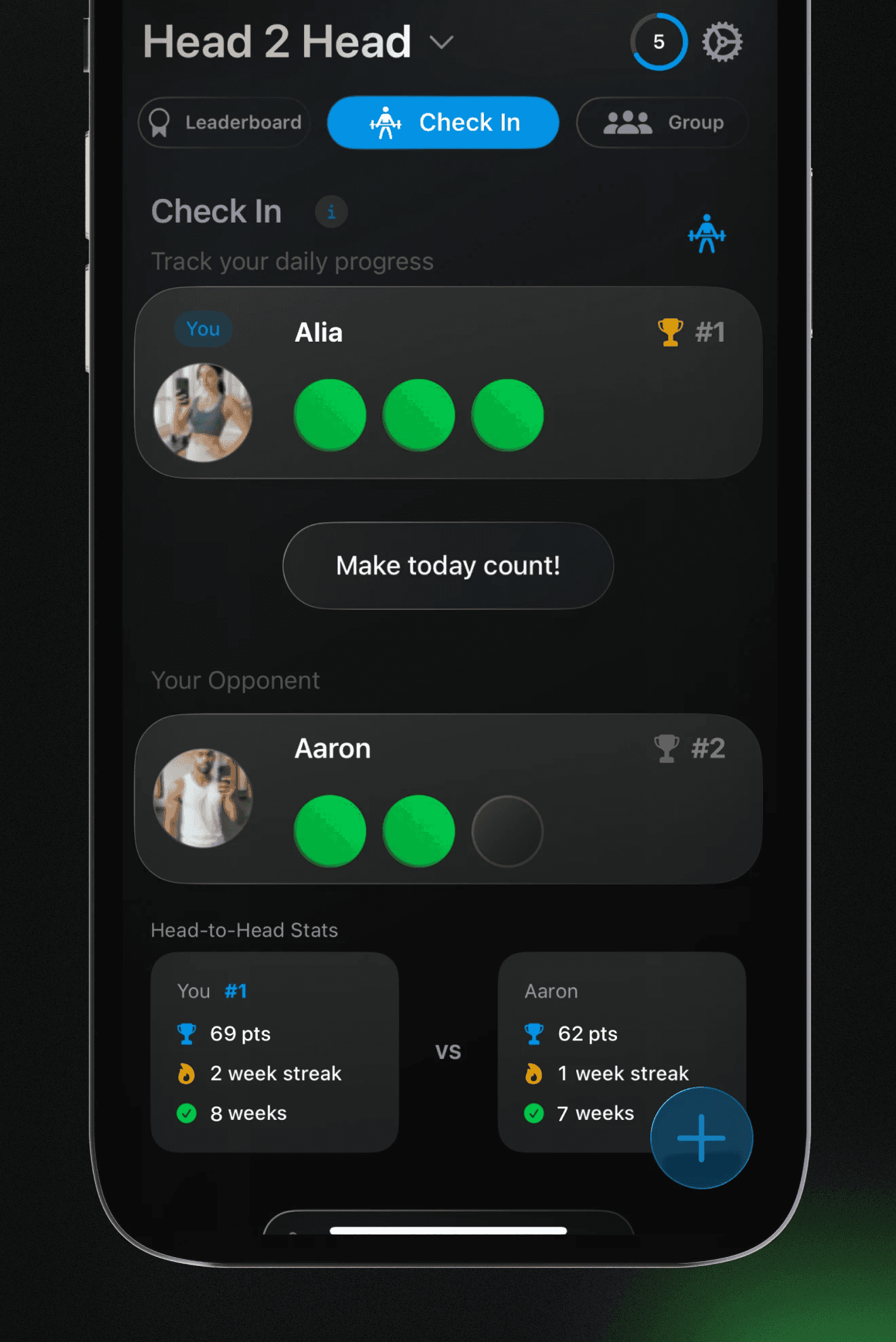
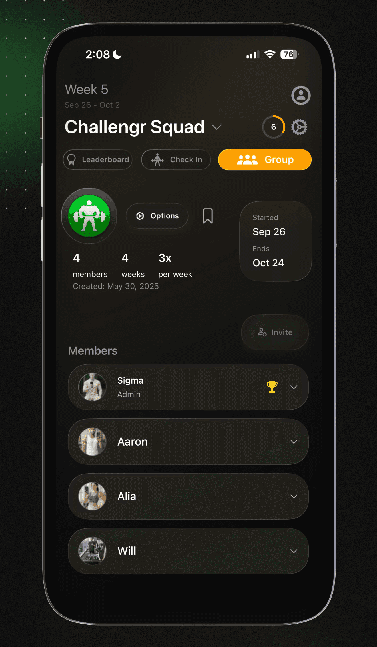
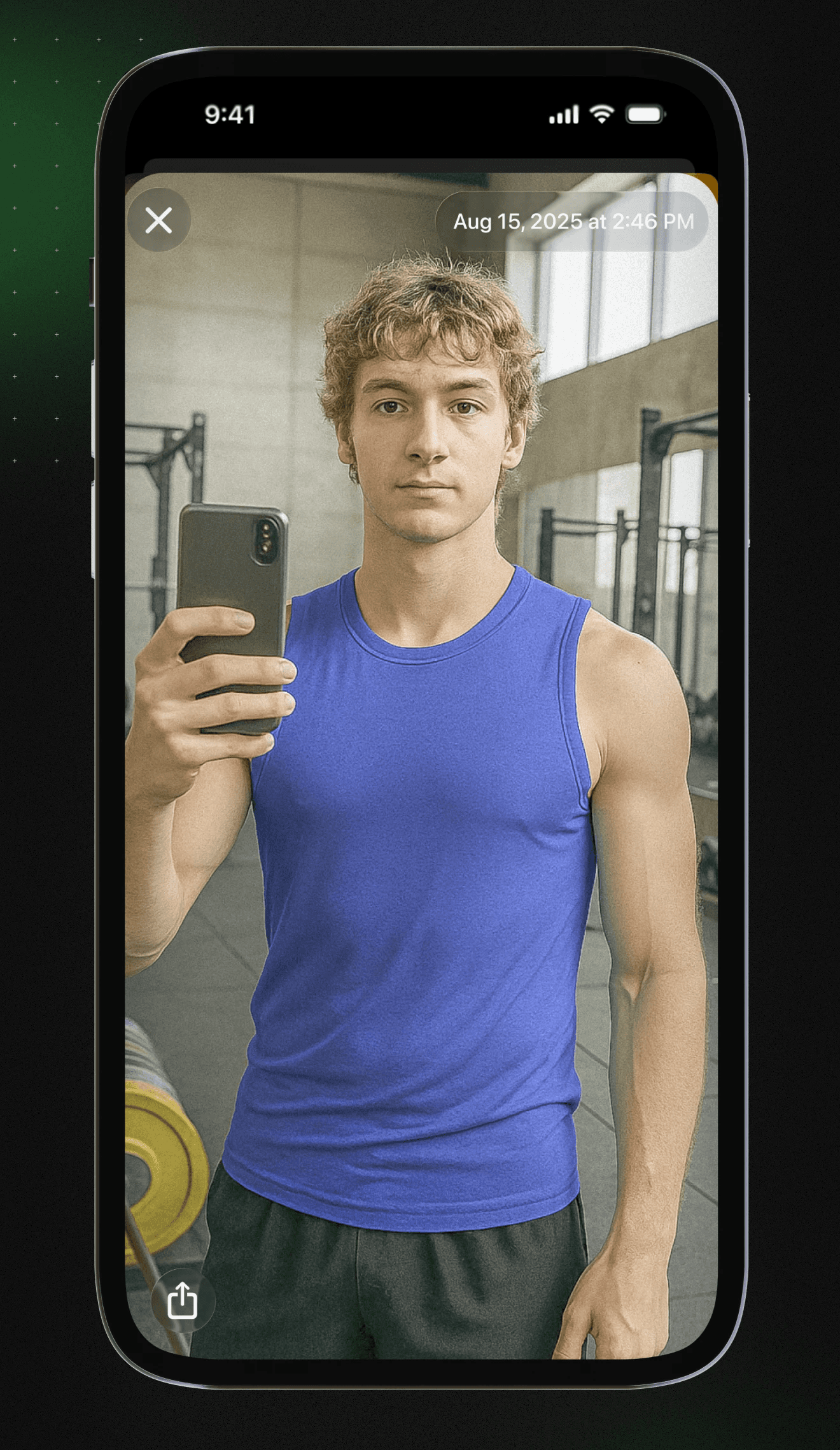
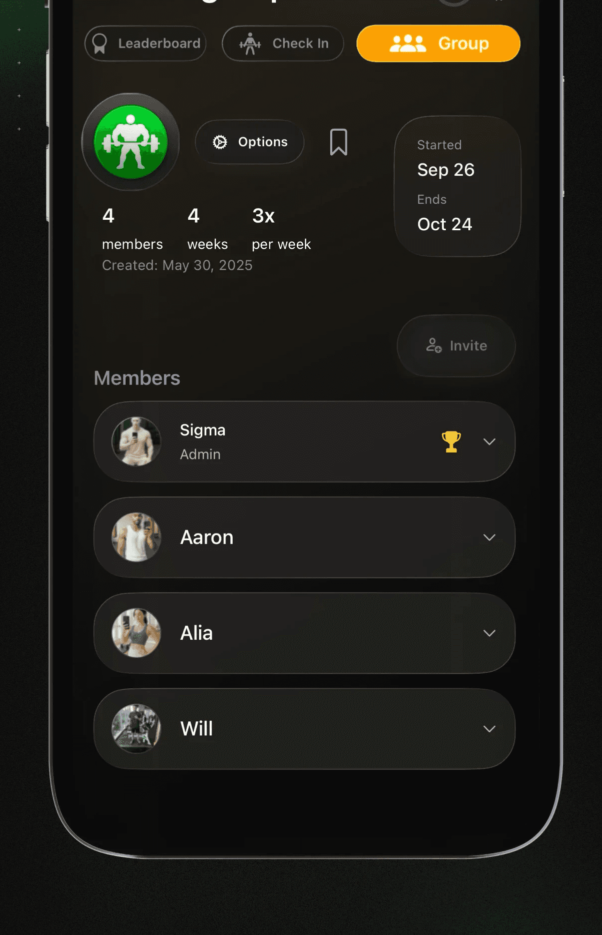
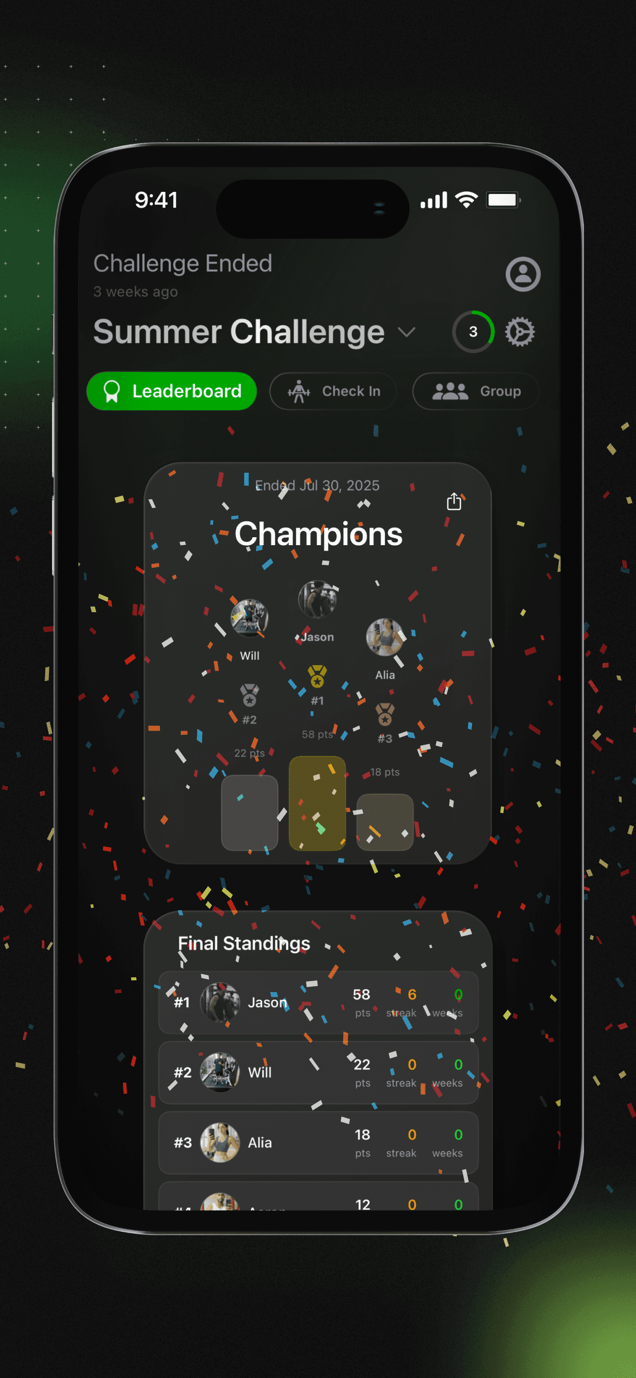
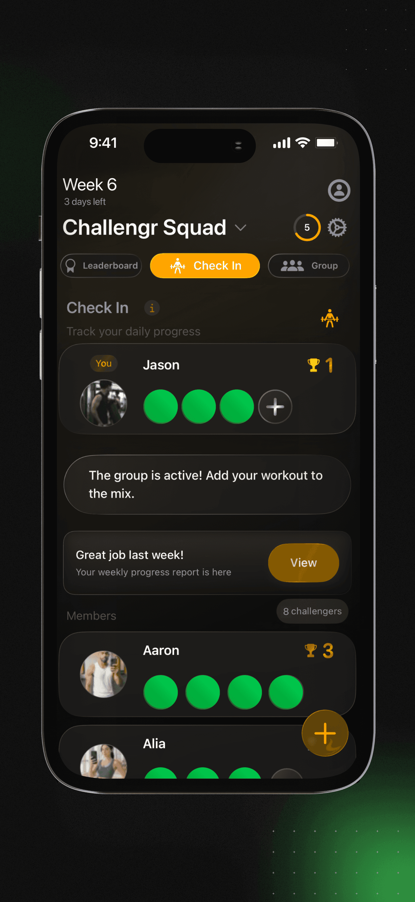
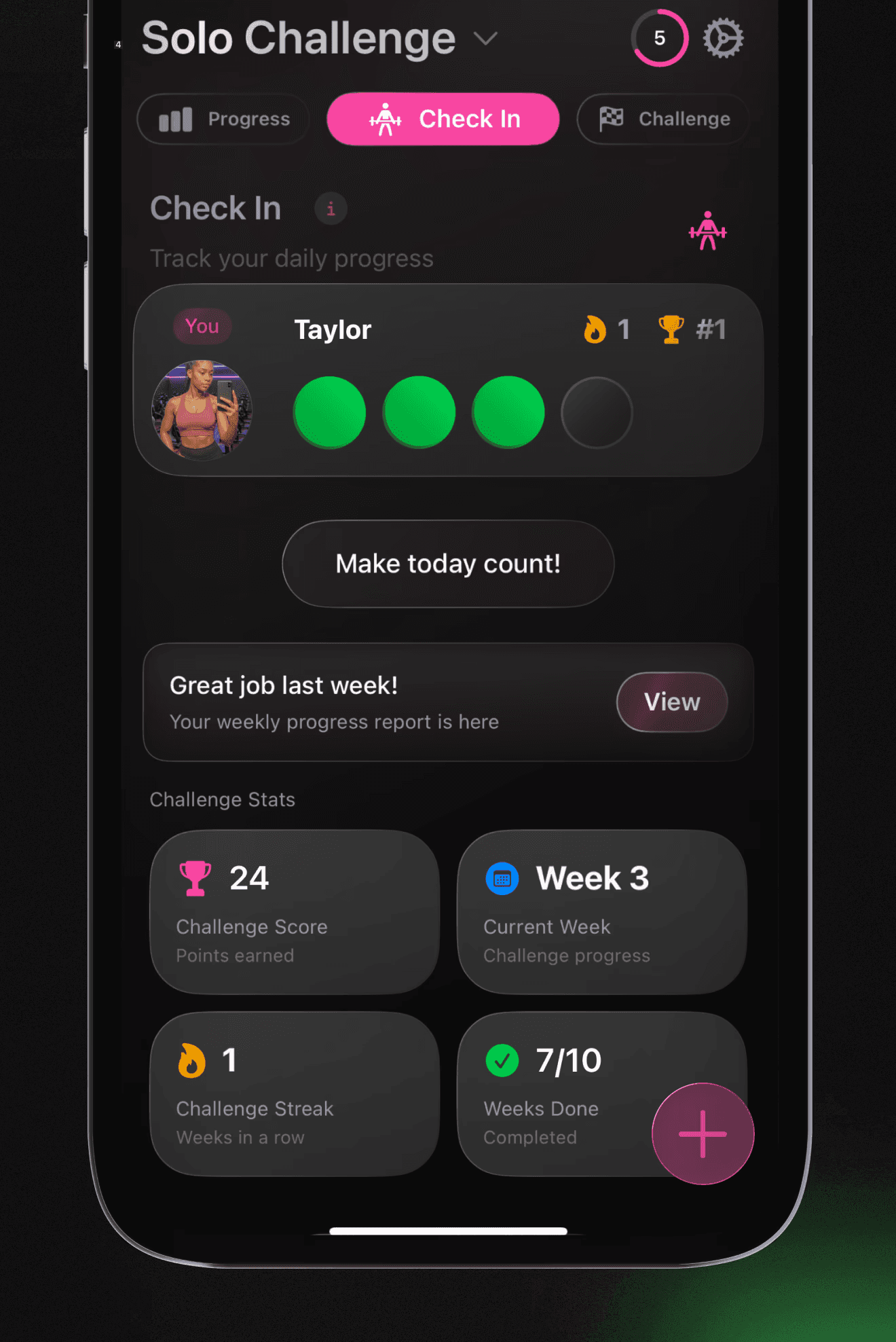
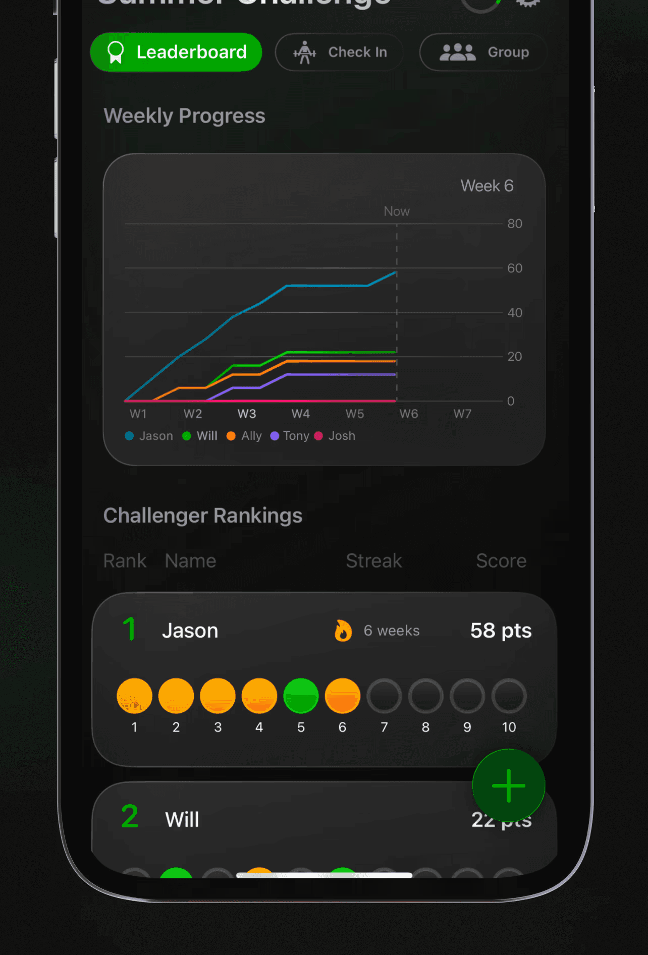
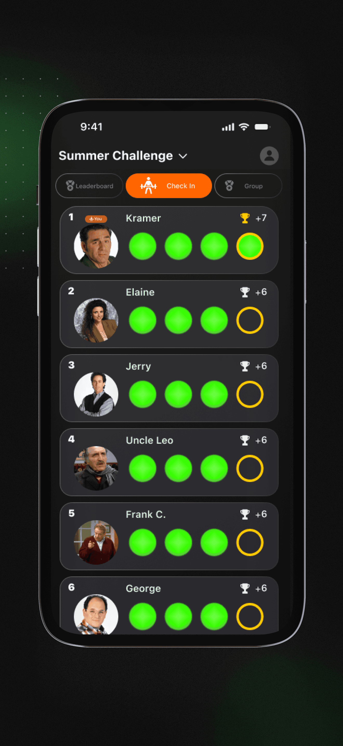
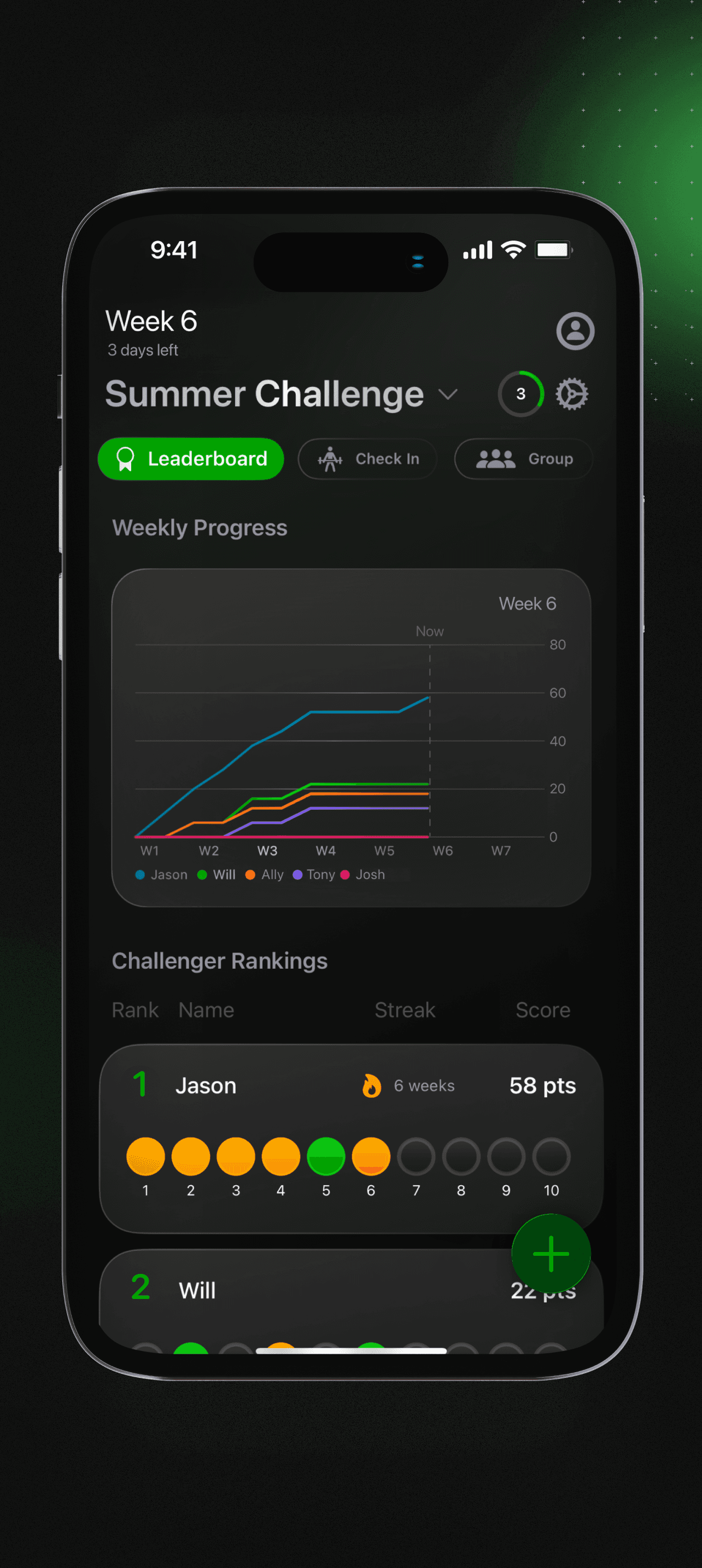
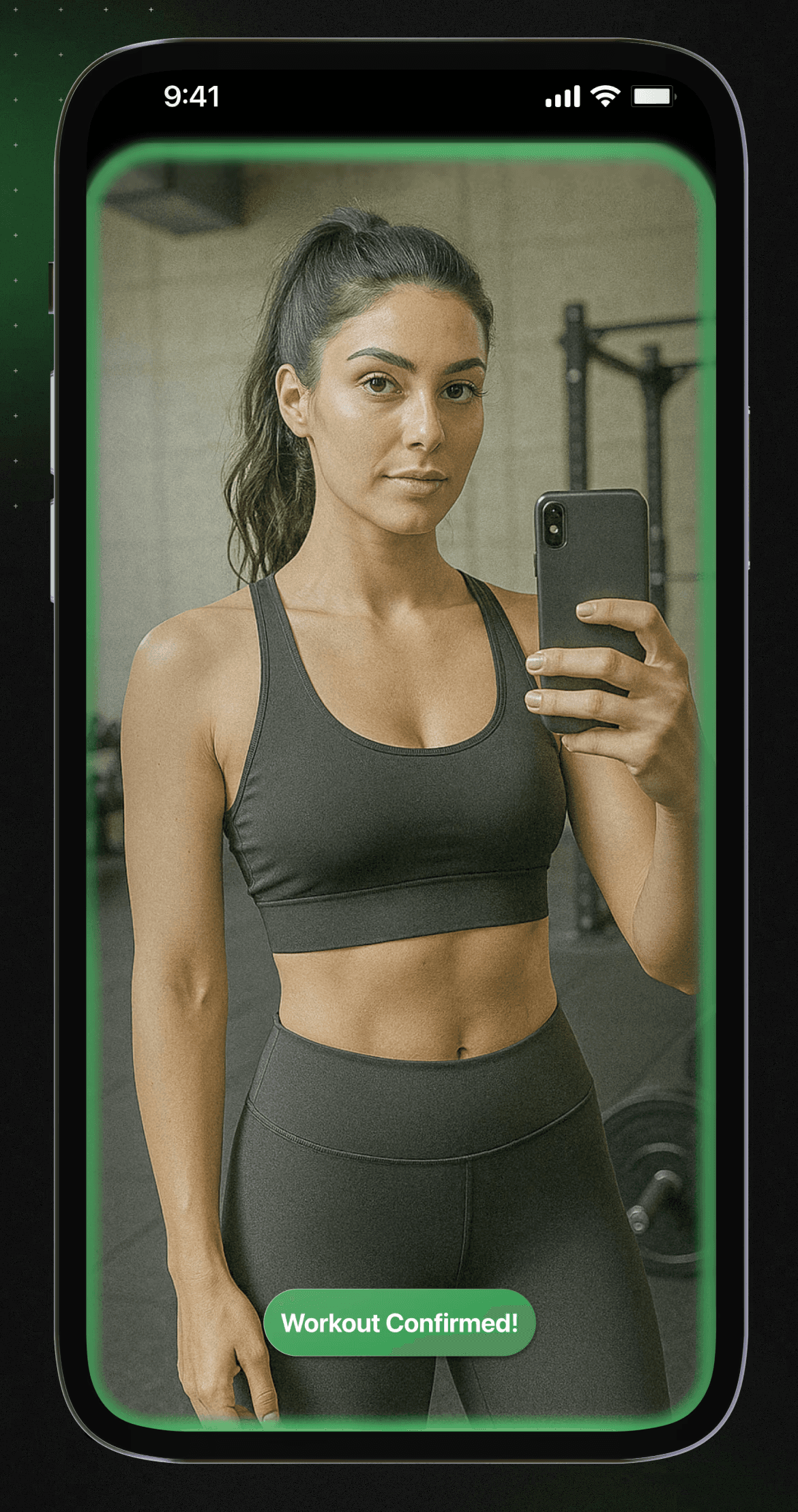
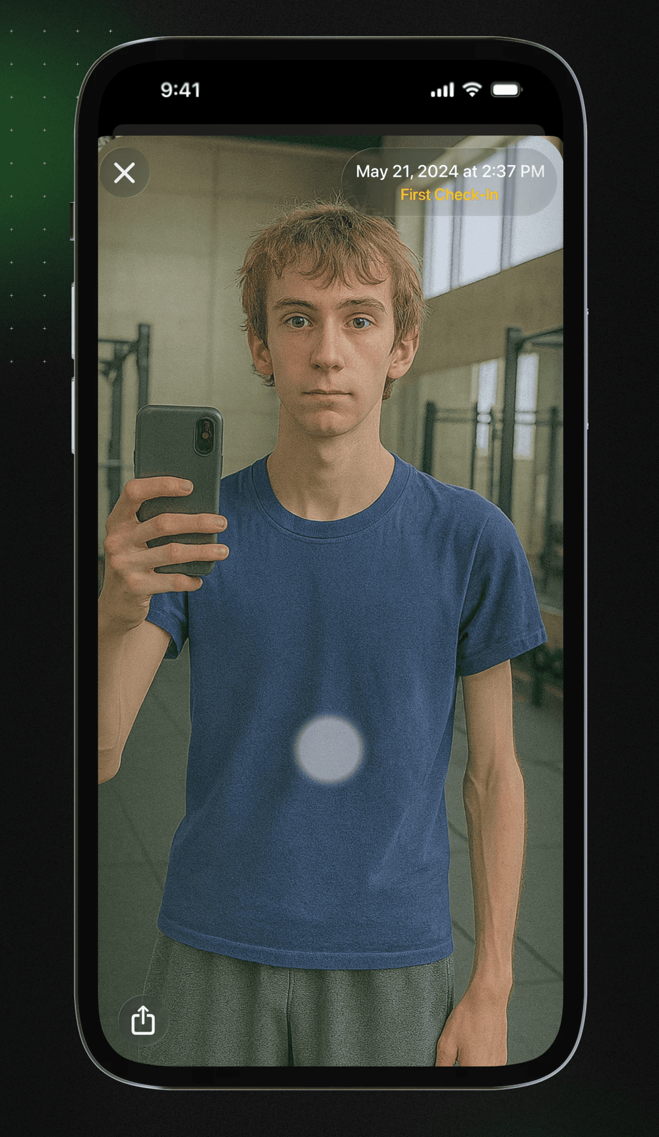
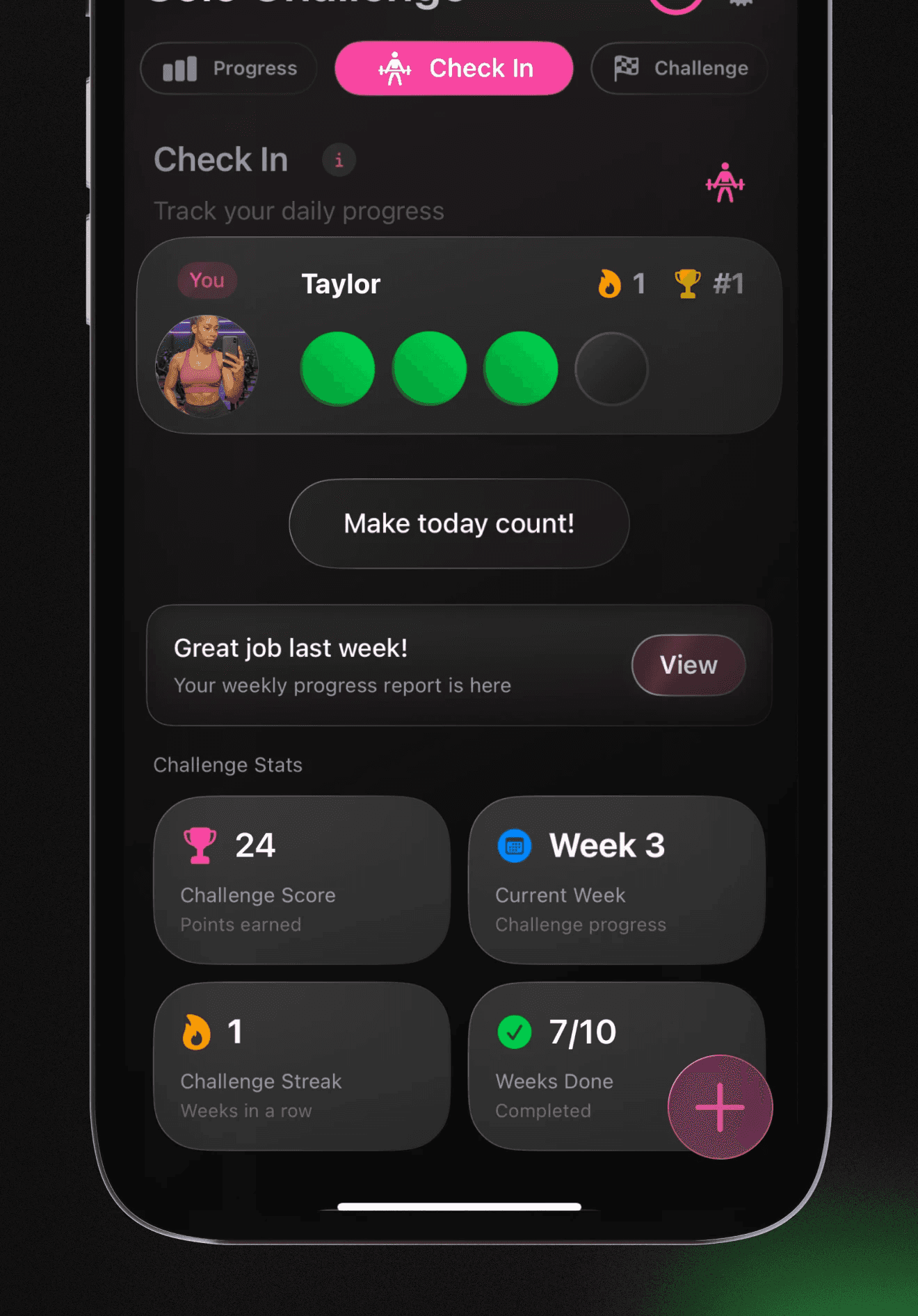
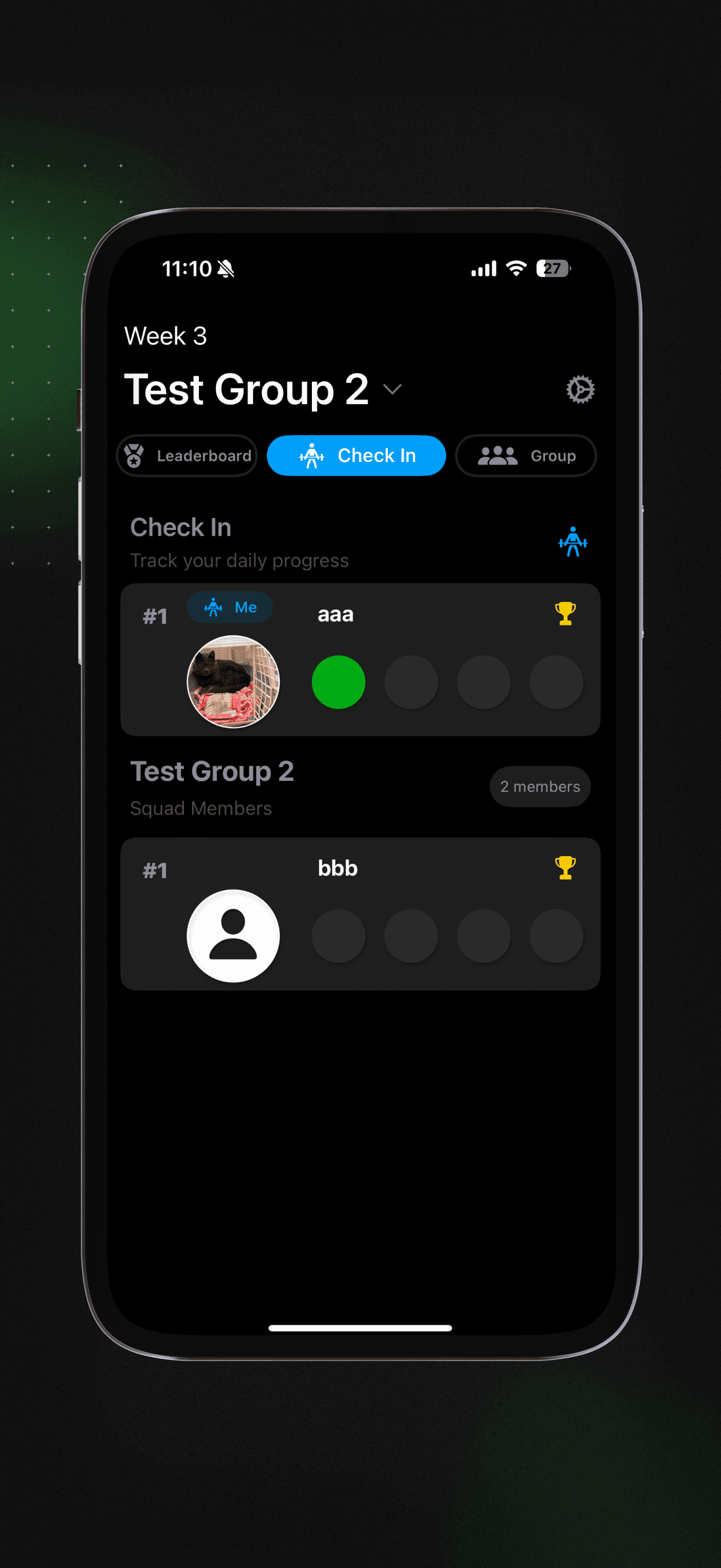
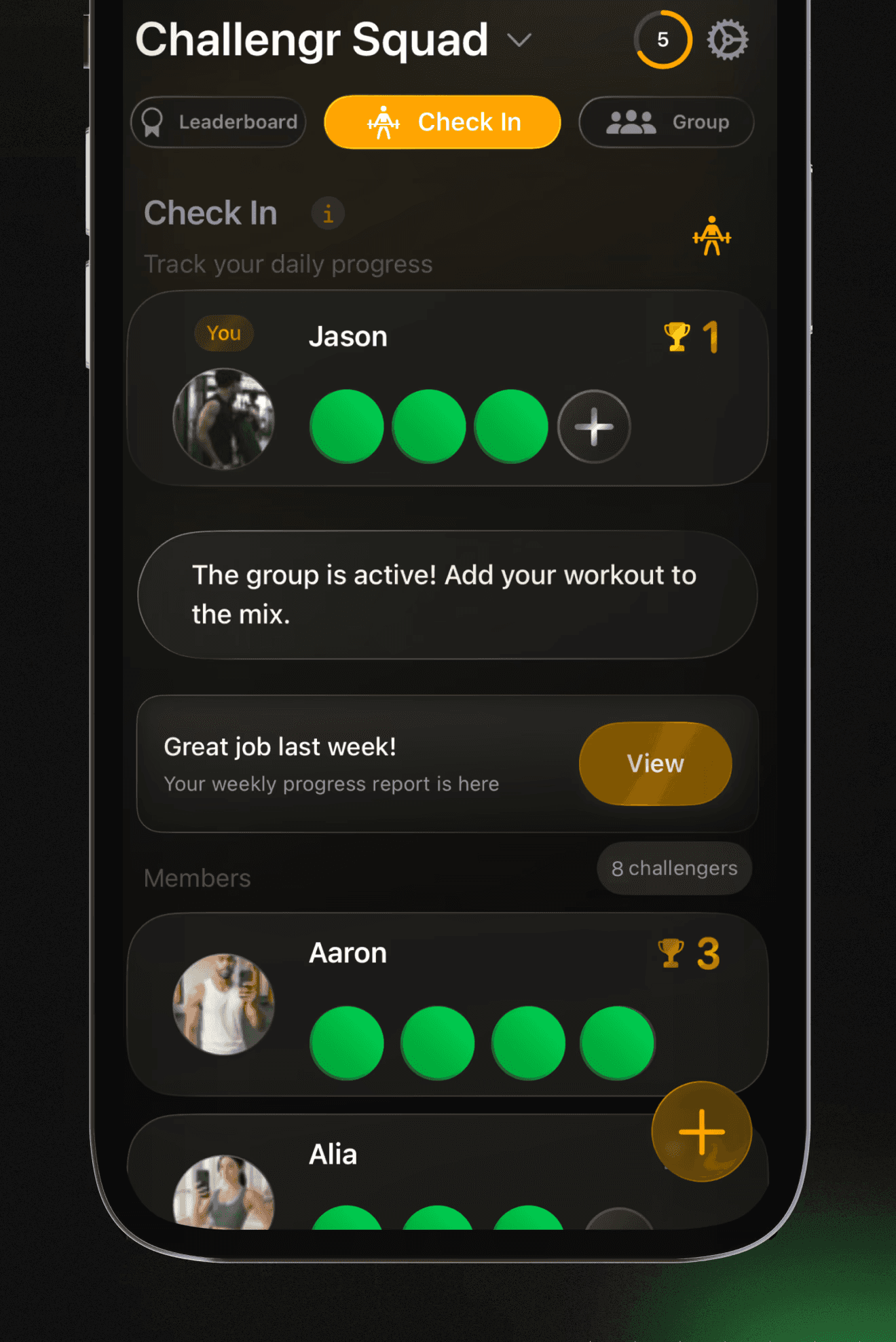
Users set a challenge length and weekly minimum, then submit workout photos to earn points and climb leaderboards.
The product keeps fitness tracking simple: no workout logs, no health-data plumbing, and no need to use a phone between sets.
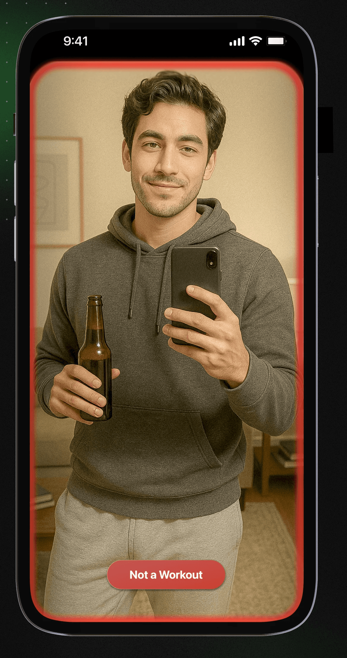
A CoreML model helps detect whether a check-in is a workout so challenges can stay competitive without creating a heavy moderation workflow.
Technologies Used
- Swift
- SwiftUI
- UIKit
- Supabase
- RevenueCat
- CoreML
- Lottie
- PostHog
- OneSignal
- Kingfisher
- Google Sign In
- Coordinator Pattern
Key Features
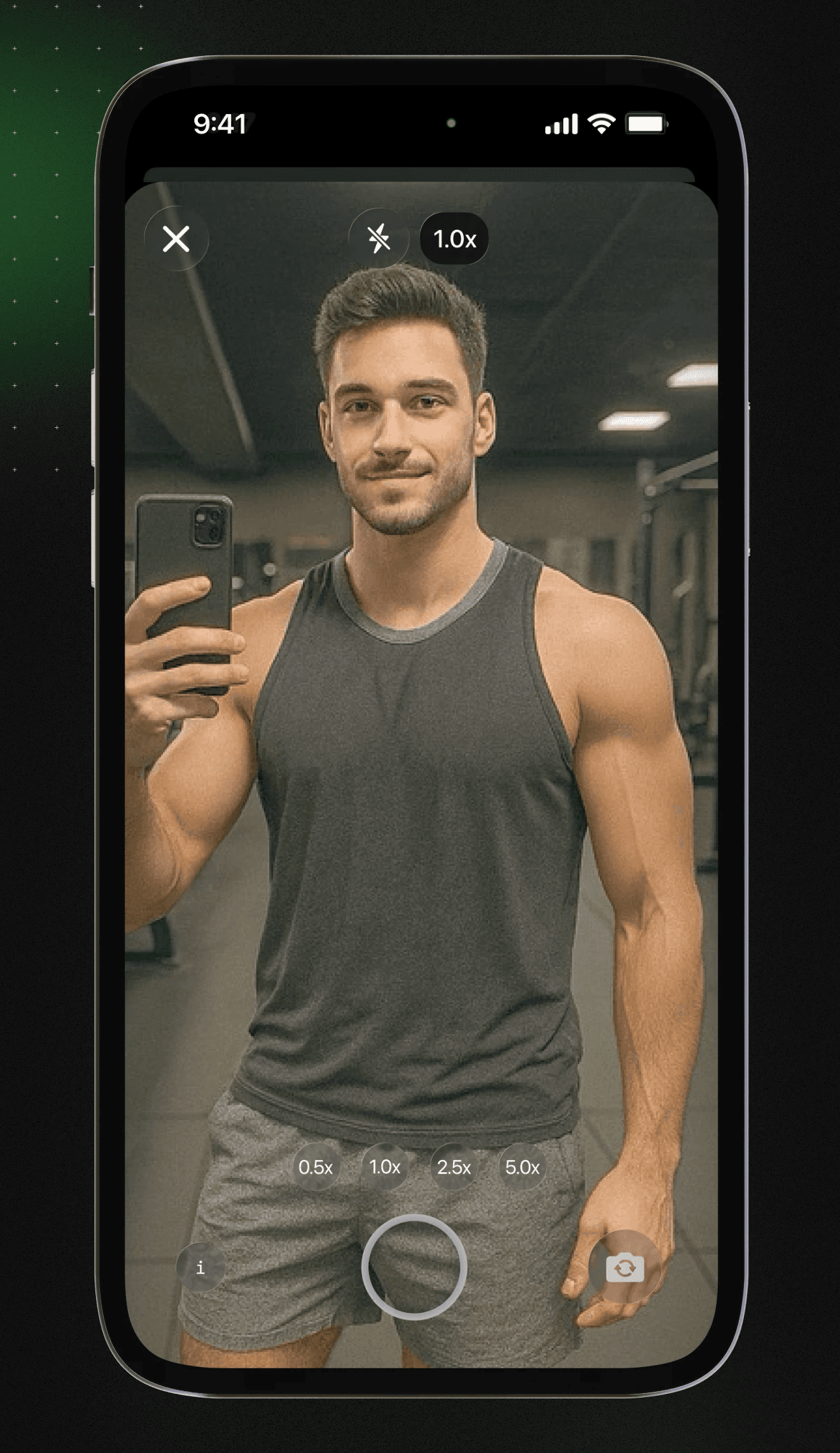
- Custom camera UI with swipe-to-zoom, pinch-to-zoom, and double-tap camera flipping.
- CoreML image classification for workout validation.
- Persistent cache, offline mode, data prefetching, and background updates.
- QR code invites, universal links, and deep links for challenge invitations.
- Supabase database, storage, and authentication with Google, Apple, and email sign-in.
- Custom paywall and subscription integration through RevenueCat.
- PostHog analytics, OneSignal push notifications, onboarding personalization, and lightweight Lottie/Metal animations.
- Custom accent colors, family sharing, and Liquid Glass support for iOS 26+.
Design
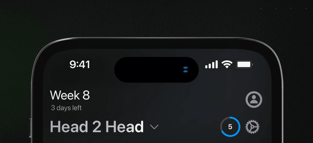
The design prioritizes minimal depth. Core actions and challenge status stay close to the surface so users can check in quickly and keep their attention on consistency rather than logging details.